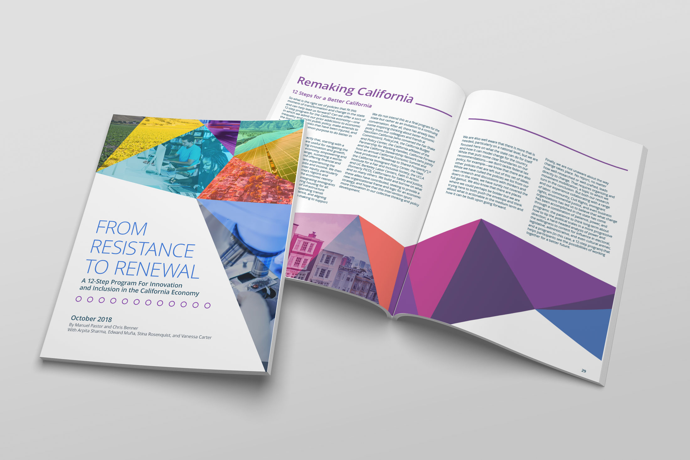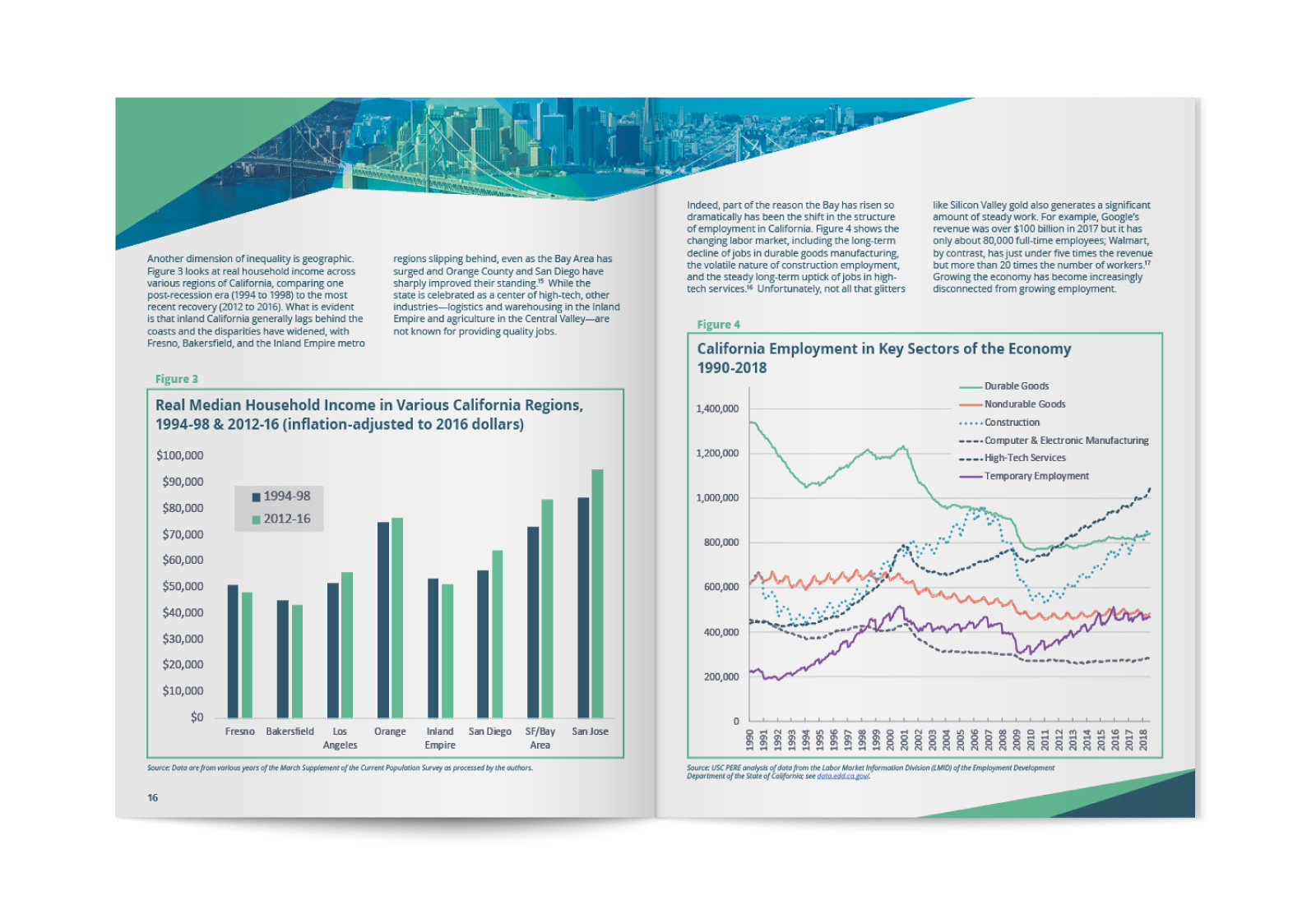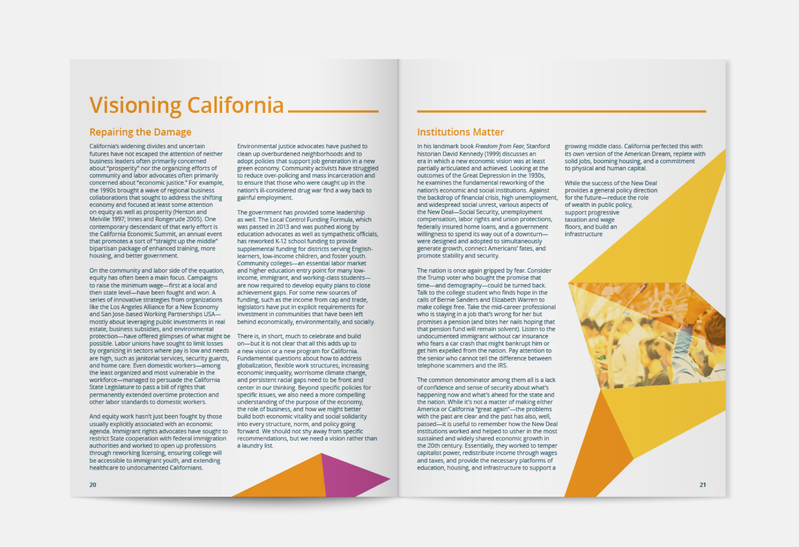
USC has a research department that compiles a lot of data into reports. I've helped them with a couple of projects. This one was my favorite. We needed to develop a look for the whole report that represented the diversity of California. Essentially, the report was its own brand. I picked fonts and a color palette with plenty of colors. This was a 116-page report divided into eight sections. I gave each section its own color theme, to help readers differentiate. The section colors all come together in the cover mosaic.


